Shenmue font:why did it change?

Joined
Nov 27, 2018
Hello~I was wondering why the Shenmue font for Shenmue 1○2 is different from the original Shenmue series. Even worse is the one used for Shenmue 3. Please let me know should you have a clue.
 
Yu Suzuki said:
“‘The one I like at the moment is that logo there,’ he said while pointing to the newer block-lettered version on Peter’s T-shirt, ‘The reason I say that is that recently – you’re familiar with cursive writing? Where each letter is joined to the next. With this one the letters are separated from each other, right? With cursive, the letters run together. They say there are many young people nowadays who can’t read cursive writing. So that’s why I decided to separate out the Shenmue logo, to make it easier to read.’

http://www.seganerds.com/2016/04/24...acter-perspective-system-soundtrack-and-more/

The guy who wrote it (known on the old boards as Yokosuka Martian) conveniently posted a photo in the article of @Peter's shirt in full view.

5_petere5uuyg5u5r685347345y345wey.png


Oh wait, no he didn't, because he's a shite reporter.
 
Like Mitts said, that was the first answer we got in regards to the logo change, which to be honest, was never going to fly. It was an MS Word font, with a bit of bevel and emboss slapped on it. The more I think about it, as with the process of game development, I really feel like it was a place holder as development went on. But the core feeling remains, in that Yu-san wanted a new logo where the letters were not cursive.

As to why he didn't stick with the original logo, that more or less sums it up, but just before Deep Silver got on board, they seemed to revert back to the original logo. I don't know if Deep Silver urged him to create the current logo or not, but the overall feeling seems to be that perhaps it's been so long, and with being a fresh beginning, he may want it all to start afresh, logo included.

Everyone will have their own opinion and that's fine, but he is the creator. If he says something goes, then it goes. I support this series, and I cannot wait to play this long awaited third game. I am not going to let some letters on a box affect my opinion of that.
 
Thanks bothbfor your replies which answer the Shenmue 3 logo. Yet, regarding Shenmue 1○2 logo, my question remains open. Why had the original "S" of Shenmue been replaced by a standard "S"?
 
We don't have an official answer.

The unofficial reason has already been mentioned. People can't read cursive anymore. A large number of grade schools stopped teaching cursive by the early 2010's, so a fair number of younger people will have difficulty reading it. The majority of people who are going to be picking this up for the first time would be part of the group that never learned it. (Although apparently some schools started re-introducing it, per a google search)

The letters in henmue are pretty standard aside from being connected, so those who aren't familiar with it probably can make it out. The S is kind of unusual given the extra dots and curve it, maybe they simplified it to prevent confusion?
 
Last edited:
The logo being changed for the re-release does puzzle me a bit, is clearly not an issue with cursive since it still is pretty cursive. Maybe they wanted to tone down the cursiveness a bit? I kind of wish they would have gone with the modern Shenmue III logo (with a II&II instead of III but still the same design) for the re releases for consistency sake but oh well, both projects were handled by very different teams so is not surprising is very different.
 
We don't have an official answer.

The unofficial reason has already been mentioned. People can't read cursive anymore. A large number of grade schools stopped teaching cursive by the early 2010's, so a fair number of younger people will have difficulty reading it. The majority of people who are going to be picking this up for the first time would be part of the group that never learned it. (Although apparently some schools started re-introducing it, per a google search)

The letters in henmue are pretty standard aside from being connected, so those who aren't familiar with it probably can make it out. The S is kind of unusual given the extra dots and curve it, maybe they simplified it to prevent confusion?

I work in a British primary school and we start teaching children how to read and write in cursive from the age of 4.

I agree with Peter on this one - fresh game, fresh logo. Think of it like a second generation Shennue.
 
Adding to your post: the original Japanese letters look great in the new logo. The English version is growing on me, especially without an emboss/shadowing--much nicer loooking when flat like the release date trailer.
 
The original Shenmue logo is still my favourite and the version that I'd hope to see on Shenmue III in an ideal world.

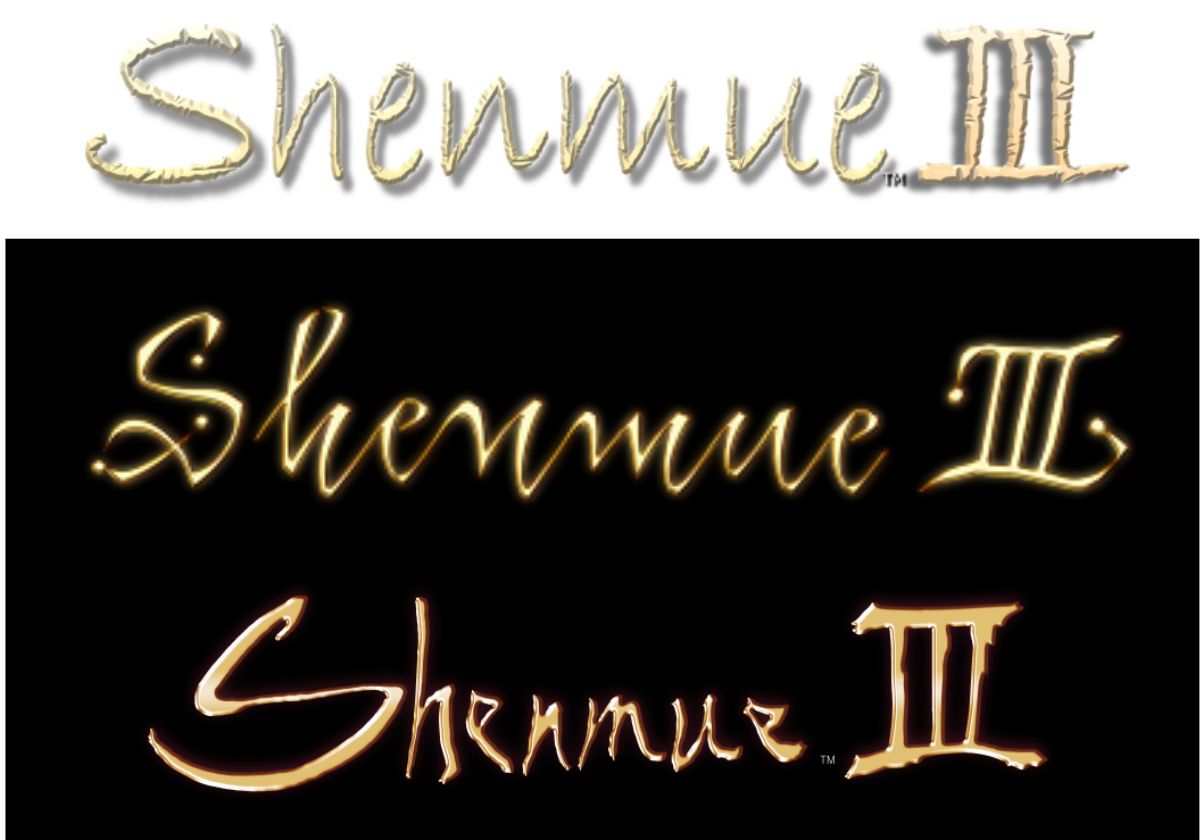
But if Suzuki really is as dead set as he seems on getting rid of cursive and making the logo easier to read, then I'm glad he's making a new one to accommodate that as I always thought the spaced out version (as seen on Shenmue IIx's box art) looked poor:
15b73b1199.png
 
The original Shenmue logo is still my favourite and the version that I'd hope to see on Shenmue III in an ideal world.

But if Suzuki really is as dead set as he seems on getting rid of cursive and making the logo easier to read, then I'm glad he's making a new one to accommodate that as I always thought the spaced out version (as seen on Shenmue IIx's box art) looked poor:
15b73b1199.png

S2x's isn't my favourite logo but I do think it has some solid fundamentals going for it, like the decreased line thickness connecting to each letter, it does help it more readable (moreso then the letters in the re-release logo) with a better contrast between forground and background.
It's just the bezel shading effect and the diagonal position that seems a bit oldschool by today's standards.

I feel like that was attempted with the second logo but again the bezel was a bit overpowering (thanks to Switch's blog for the image blow)
logo-comparison.jpg


3's logo imo looks at it's best when it's monotone and flat, like below.
1543592001095.pngIt has grown on me, but I feel like the proportions of everything and consistency in thickness would go a long way to improve it.
 
Even though it's not going to stop me from playing and enjoying the Shenmue III experience. I really wish he would go back to the original logo. Or at least the modified version that Sega used on the re-release. If it aint broke, don't fix it.
 
@Flagship that's the best I've seen the new logo. However I'm still not a fan of it.

But meh could be worse and it won't stop my enjoyment of Shenmue 3
 
Maybe the inconsistent thickness and proportions of the letters are supposed to be indicative of the mood/vibe of the story. Like... the logo has a very unsettled feeling due to those issues. Maybe it's intentional and not just an issue of Yu Suzuki's lack of experience in writing in the Roman alphabet. Ryo is seemingly going to be confronting Lan Di, and in doing so, essentially confronting his own desire to go down the path of vengeance. Maybe this is representative of his internal conflict.
 
Shenmue III logo is bad. Like really bad...

Maybe Suzuki San should concider style like this for the Shenmue front cover art:

large
 
Back
Top