Logo changes...

Kodama

Now Loading...
Banned
Joined
Jul 28, 2018
Location
New York
PSN
Shrooms
XBL
Grampa Gohan
Steam
(BANGS) BASS wub wub
Dreamcast Now
Kodama
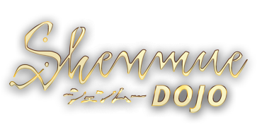
I know we can really only speculate, but I'm really wondering what's going on with the logo. For those who don't know, Shenmue 3 first campaigned with a strange logo, and backers pleaded with them to make the logo more like the original. At first they complied and remade the logo using the old font, but then just a few short months later after announcing their new partnership with Deep Silver, changed it to yet another strange logo...

I had my suspicions back then that maybe there was some sort of licencing issue with the logo preventing them from using it. Some legal mumbo jumbo I could never understand, but who knows what the real reason is...

Anyways, the HD release came out with yet another new logo, very close to the original but not the same. Seems like a strange and Arbitrary change to make, but I didn't think much of it. Then I saw this:
Shenmue_20180904062933.jpg
They actually changed one of the in game assets to reflect their new logo. This seems VERY strange considering it's not like they routinely updated a bunch of textures in this game. It's almost like maybe they HAD to change the logo... maybe there really is some weird legal reason for changing the logo, even though this is from SEGA themselves?

So am I just looking too deep into this and I'm crazy or maybe am I on to something here?
 
Man after my own heart, I raised this a little while back (Shenmue Branding).

They NEED to retain the original logo for brand consistency, also the new Shenmue 3 one is naff.
 
I believe it has something to do with newer generations finding it harder to read cursive writing (pointed out below). Sega perhaps agree on some level, hence the slight alteration in the 1&2 logo, particularly with the 'S' and 'h'.


As for the Shenmue 3 logo, I think its really just as simple as Suzuki not wanting to use the old logo and instead wanting something completely new. Fans alerted him to their preference for the old logo and he went ahead with this entirely new one. His reasoning is he wants something more from the heart, hence the paintbrush.

I also recall reading somewhere that his own father created the Japanese logo for Shenmue and now Suzuki himself would like to carry that tradition with Shenmue 3.
 
I consider the original Japanese logo to be perfect. Beautiful, strong and authentic.

It’s no secret that I don’t like the Shenmue 3 logo as is. Frankly, I find YS’ reasoning for the lack of cursive to be flat-out silly, but, in spite of that, I do find the idea of him designing the new logo to be very sweet. It’s something I can get behind; I just wish that the final results were better.

Japanese calligraphy is one thing, but applying that concept to Latin letters is…tricky, especially for a non-native like himself. Whereas the original Japanese logo (from YS’ father) exudes strength, the gold Shenmue 3 one just screams “insecurity”. It’s a clear contrast.

I will end this on a positive note: I find the white Shenmue 3 logo to be more palatable than the gold-embossed one. Having said that, much like everything else in this franchise, I do hope that it’s still WIP.
 
I believe it has something to do with newer generations finding it harder to read cursive writing (pointed out below). Sega perhaps agree on some level, hence the slight alteration in the 1&2 logo, particularly with the 'S' and 'h'.


As for the Shenmue 3 logo, I think its really just as simple as Suzuki not wanting to use the old logo and instead wanting something completely new. Fans alerted him to their preference for the old logo and he went ahead with this entirely new one. His reasoning is he wants something more from the heart, hence the paintbrush.

I also recall reading somewhere that his own father created the Japanese logo for Shenmue and now Suzuki himself would like to carry that tradition with Shenmue 3.
While I understand that this is the narrative, I'm not so sure I believe it...
 
I've heard that explanation of younger people not being taught cursive, but I haven't seen any studies that really back up that assertion. Like I said on the old Dojo, I don't see companies like Coca-Cola, Ford, Ray-Ban, Kellogg's, Fender, etc. sweating this notion of people not being able to read their names.
 
I've heard that explanation of younger people not being taught cursive, but I haven't seen any studies that really back up that assertion. Like I said on the old Dojo, I don't see companies like Coca-Cola, Ford, Ray-Ban, Kellogg's, Fender, etc. sweating this notion of people not being able to read their names.

Because it’s utter bullshit. How many letters when written in cursive differ so much that they are unrecognizable from their print form? Maybe two?
 
In all seriousness I'm not a fan of the Shenmue 3 logo. I understand Yu wanted to change it so that's his call. It's very similar to papyrus font if memory serves me correctly?

I'd be happy with the original or HD varient
 
To be honest I kind of like the new logo, now. At first I hated it, but watching the new trailer I realized it looks quite good... but, anyway, the cursive thing is the silliest excuse I ever heard...
 
In all seriousness I'm not a fan of the Shenmue 3 logo. I understand Yu wanted to change it so that's his call. It's very similar to papyrus font if memory serves me correctly?

I'd be happy with the original or HD varient

I'm sure replacing it will be the first mod released. I'm also starting to think he made it just so we'd moan about something other than the character models.
 
I'm sure replacing it will be the first mod released. I'm also starting to think he made it just so we'd moan about something other than the character models.
What do I have an image of Yu sat there with a fishing rod waiting for the bite lol.

I'm of the opinion the old one is better but if Yu wants to change it then that's his call. It seemed to fit better in the trailer than it does as a standalone thing.
 
I thought the new logo looked great in the new trailer, especially with a light blue colour instead of gold. I actually think it's good to try and change things up for the third entry and to differentiate it slightly from the originals.

The papyrus font was atrocious and really, really amateur. I have no idea why they thought for even a second that would be appropriate or acceptable.
 
I like the look of the new logo too, especially when its presented in a single colour:

Cvr.jpg

The papyrus font would have been a laughing stock. Really glad they didn't go with that.
 
The latest logo looks fine in white on black. It's okay. It looks like the Yakuza font. It's just about acceptable but it's nowhere near as good as the classic logo.
 
Back
Top