Shenmue branding.

FRASIER

“I’m listening”
Joined
Aug 3, 2018
Location
Lincoln, UK
Favourite title
Shenmue
Currently playing
Rocket League
Hello, long time away....be gentle with my first post.

So I've been casting a careful eye on the recent Shenmue 1 & 2 promotional material and it far outshines Shenmue 3. Noticeably the recent videos by Corey Marshall and that first announcement video, the font used in the wording and the retouched logos are brilliant. I just keep thinking about Yu's logo he's done for Shenmue 3 that we saw a few KS updates ago (has it been finalised do we know?) it's just not in keeping with series and Deep Silver seem to be slapping it all over their marketing.

Just a 'III' using the new (SEGA) Shenmue HD collection logo will be the right way to go.

Am I alone in this?


SHENMUE12_LOGO_BL.png
 
You are not alone in this. A lot of kickstarter backers implored YSnet to use the old logo... at first they complied... then like a month later Yu Suzuki himself drew some shit in crayons using his toes and now apparently that's the new logo. The only logical explanation I can think of is licencing issues with the logo or something, there is no way anyone would make such a horrible decision on their own...
 
Sorry, but why would Sega allow the use of the IP and all assets, but for some reason prevent YsNet from using the logo?
No idea, I'm not a copyright lawyer. But all things considered, it seems like the logo was slapped together in a hurry to avoid some sort of threat of SOME sort, whatever that may be. Nothing about it makes any sense at all if you follow the timeline of events:

-Shenmue 3 kickstarter has an original logo
-Backers demand use of the old logo
-YSnet complies, revise logo
-Deep Silver gets involved
-Immediately logo is changed under the guise of the excuse that "Yu Suzki loves this logo"

I mean you're right it very well could be as simple as Suzuki just really loved this logo and decided on the change himself, but none of that adds up. Especially when you consider logo design is one of the last things that should have been on his mind in that point during development, the issue was already settled just months prior. It's only a theory but I really think there was some sort of legal issue that Deep Silver brought to their attention and they had to change it real quick...

And if it IS real just as simple as Suzuki really liked that kindergarten fingerpaint logo better, than I'm worried he's gone George Lucas/Kojima on us...
 
Last edited:
d... then like a month later Yu Suzuki himself drew some shit in crayons using his toes and now apparently that's the new logo.
This had me in stitches! ?

You are not alone, I love the old logo and the new logo for the re-release is great! It's a clean, modern version of the logo. The KS logo is... well less said the better.

Now, I wouldn't take it too serious before we are in the home stretch. The logo is not the main focus, I promise you that. They are focusing on the game, and the logo will come later. Once Deep Silver plan the launch, we will see.
 
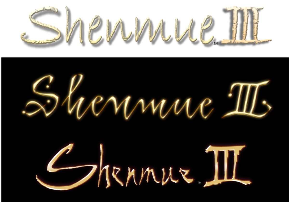
Here is the evolution of the logo so far.

logo-comparison.jpg
 
then like a month later Yu Suzuki himself drew some shit in crayons using his toes and now apparently that's the new logo.

Bwahahaa. Okay, I'm ecstatic we're getting Shenmue 3 and I trust and love Yu, but this made me laugh far more than I'm willing to admit.

I'm kinda used to the new logo now... but yeah, calling it amateur would be too kind to be honest.
 
The original reasoning behind the change was quite silly too; IIRC, it was something about being scared to use cursive since the new generation might not be able to read it?

Y(o)u gotta have more faith in people ;)

…Sega got scared too I guess, but they at least came up with something elegant, in line with the spirit of the original logo.
¯\_(ツ)_/¯
 
That papyrus logo was really bad. Can't say I'm a fan of the gold colouring either, even in the original shenmue font.
 
At least it is better than the first KS placeholder logo. Hopefully for consistency sake, and just a better idea, they gof or the altered HD cover font for the final art.
 
You are not alone in this. A lot of kickstarter backers implored YSnet to use the old logo... at first they complied... then like a month later Yu Suzuki himself drew some shit in crayons using his toes and now apparently that's the new logo. The only logical explanation I can think of is licencing issues with the logo or something, there is no way anyone would make such a horrible decision on their own...

Ahahaha.:LOL:
You have quite the attitude there, bud. But yeah, I will miss the old logo. It's still at least better than that horrible original logo, anyway.
 
I wonder if with the HD releases they might consider using the old one. Unless of course there are legal issues with it which would seem odd given Yu has access to all assets
 
The new logo doesn't bother me but...Dear God! That old papyrus font! :eek:
 

Really clever this, as crazy as it sounds I just can't relate to Yu's design, it's just not in keeping with the series, my attachment to it decreases.

Weird but it's true and a very odd choice, i can't believe it's anything to do with rights as there was a logo before this true to the saga.
 
Back
Top